Styleguide: Simple (Default)
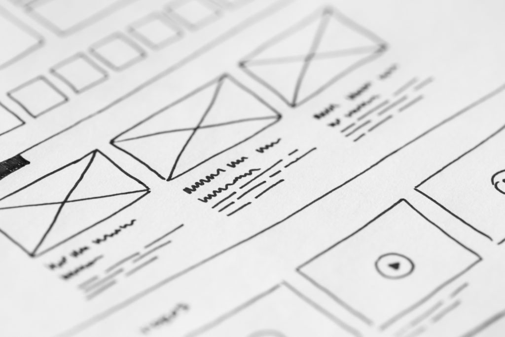
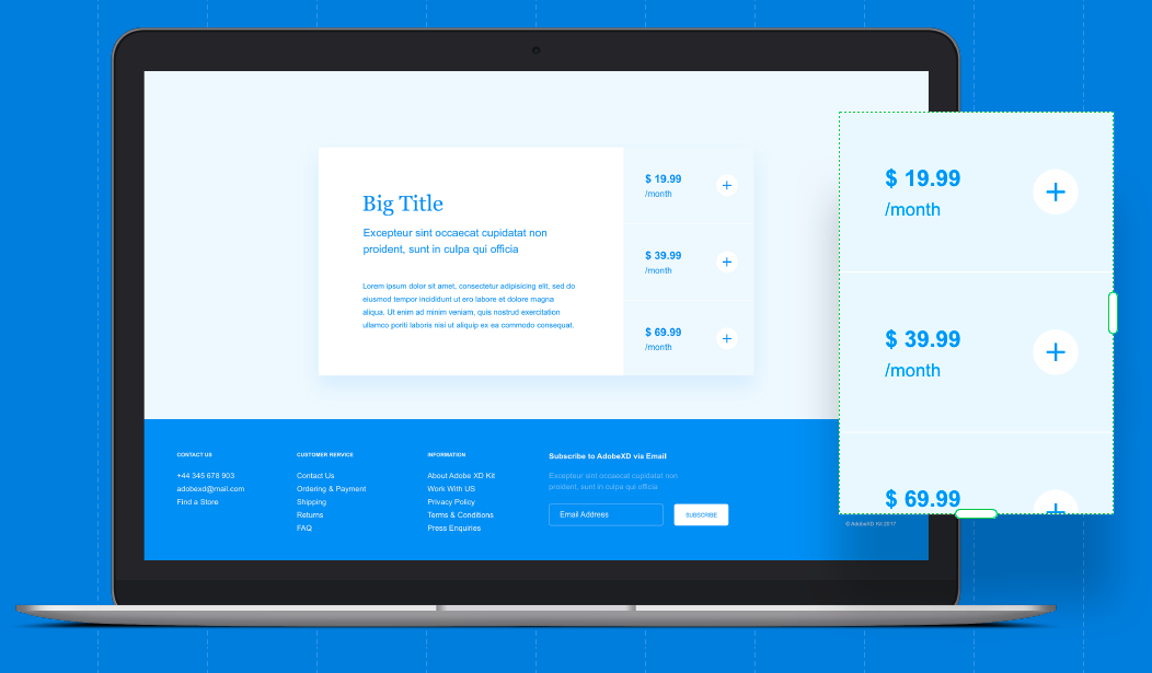
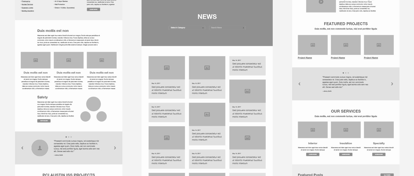
This style will have a “wireframe” feel, while still being clean enough to actually use if you change the font and colors. It would not be groundbreaking in design, but better than most of similar sites with minimal effort. Inspiration is pulled from wireframes and plain “dummy” design without any specific styles.
This would also be the default style within the theme. Additional styles could be adjusted in Child Themes.
- The style is clean, without being super modern.
- It should be neutral without being boring. (As much as possible.)
- The style should be simple, but not minimalist.
Inspiration
Table of Contents
General
On a general note we will try to stay within the utility classes of Tailwind, while also keeping a general ruleset. (Please give me a heads up if this is not ideal.)
Rules
- Font-sizes are mainly rem
- Padding/Margins are mainly rem
- CSS is mainly tried to set at a high as possible level, and let blocks/child themes overwrite. While keeping the ability to add further styling with custom CSS if needed. This also allows third party plugins to easily overwrite our settings if needed. E.g. for a bad use of a h6 in a plugin that in theory should be a custom H2.
Colors
We should try to keep the block settings for this concistent, so blocks inherit based on the styleguide.
Primary
#000
Secondary
#444
Accent
#000
Headings
#000
Normal Text
#111
Shade 1
#DBDBDB
Shade 2
#EFEFEF
Shade 3
#F9F9F9
UI Positive
#78DB2F
UI Negative
#FF6235
UI Information
#FFF63C
Typography
Text sizing is mainly controlled by Tailwind. Including headings and misc. objc. All sizes set by REM, with the base theme size being 16px.
Primary Font Family
This style will be using “Source Sans Pro” as the primary font family. A simple and legible font family.
Secondary Font Family
This style will not be using a secondary font family.
.text-6xl font-size: 4rem;
H1 - This is some very big text.
.text-5xl font-size: 3rem;
H2 - This is some bigger text.
.text-4xl font-size: 2.25rem;
H3 - This is some big text.
.text-3xl font-size: 1.875rem;
H4 & P - This is some small text.
.text-2xl font-size: 1.5rem;
H5 - This is some smaller text.
.text-xl font-size: 1.25rem;
H6 - This is some very small text.
.text-lg font-size: 1.125rem;
Page width, Breakpoints, Padding, Margin
Not sure how we should define this? But this would but this would prob. be smart to have defined? Or this a more per module setting? Scenario: I want to create a “fluid and white space heavy” style. Would this be best set at a top level?
Data: N/A


